Relative Advantage of Spreadsheets in the Classroom
This week in EdTech 541, we read about and designed spreadsheet and database activities. Utilizing spreadsheets and databases does not have to be a boring activity within a classroom. As soon as one states the term spreadsheet, it may seem that would be boring to students. However, the biggest advantage of a well-written activity involving spreadsheets and databases in a classroom is that it makes the lesson student centered rather than teacher centered. It would not be a powerful lesson if a teacher just shows their students an example of a spreadsheet. An excellent activity for high school level students in AP Statistics is to have students begin building and formulating their own spreadsheets!!
Four Ways to Use Spreadsheets and Databases
1. Organizing Data
To help geometry students discover the formulas to calculate the sum of the interior and exterior angles in a polygon, the instructor can have students build a variety of polygons on Geometer's Sketchpad (GSP). GSP allows students to build and measure polygon angles quickly. Since students are already on the computer to use GSP, now have them build a spreadsheet which includes all numerical data they just found to help them determine the formula that will correctly calculate the total sum of the interior and exterior angles for any polygon.
To help geometry students discover the formulas to calculate the sum of the interior and exterior angles in a polygon, the instructor can have students build a variety of polygons on Geometer's Sketchpad (GSP). GSP allows students to build and measure polygon angles quickly. Since students are already on the computer to use GSP, now have them build a spreadsheet which includes all numerical data they just found to help them determine the formula that will correctly calculate the total sum of the interior and exterior angles for any polygon.
2. Programming Formulas
Another essential feature is to design the spreadsheet to compute multiple calculations many times. Students may still collect some data points, then program the spreadsheet to do the repetitive computations. For example, when students are learning how to calculate the volume of a rotated region in calculus using the disk and washer methods, the process that an integral does can be demonstrated using a spreadsheet. An integral adds up all the volumes of the slices formed where each width is so thin its value approaches zero creating a slice that always fits perfectly. Students could measure the volume on several food items, like a banana, an egg and/or a bagel. They would slice the food into a disk or washer shape and measure the radius of each piece. To save time computing each individual volume slice, students could enter the radius of each slice, then program the formula and have the spreadsheet calculate all the volumes and add them up.
Another essential feature is to design the spreadsheet to compute multiple calculations many times. Students may still collect some data points, then program the spreadsheet to do the repetitive computations. For example, when students are learning how to calculate the volume of a rotated region in calculus using the disk and washer methods, the process that an integral does can be demonstrated using a spreadsheet. An integral adds up all the volumes of the slices formed where each width is so thin its value approaches zero creating a slice that always fits perfectly. Students could measure the volume on several food items, like a banana, an egg and/or a bagel. They would slice the food into a disk or washer shape and measure the radius of each piece. To save time computing each individual volume slice, students could enter the radius of each slice, then program the formula and have the spreadsheet calculate all the volumes and add them up.
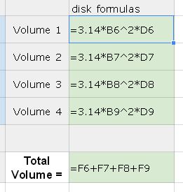
Formula Entry Example
3. Building Graphs
Again an activity that would have students build graphs on a spreadsheet, may still involve students to collect data. An example of a data collection and graph building activity could take place in an AP Statistics course. Have all students in all AP Statistics courses collect data on their hand span width and height in centimeters. Students should enter their data onto a common spreadsheet. Once all data is collected, students can download the data and build a scatter plot of the data to determine if there is a correlation.
Again an activity that would have students build graphs on a spreadsheet, may still involve students to collect data. An example of a data collection and graph building activity could take place in an AP Statistics course. Have all students in all AP Statistics courses collect data on their hand span width and height in centimeters. Students should enter their data onto a common spreadsheet. Once all data is collected, students can download the data and build a scatter plot of the data to determine if there is a correlation.
|
|
|
4. Using Spreadsheets to Make Inferences
Another very important way to use spreadsheets is to create fitted lines or curves to data. Then students use the function found to make predictions about possible future values. For example the above data that graphs hand span versus a person's height shows a strong positive linear correlation. Students can use the spreadsheet to find a line of best fit, then use this line to make a prediction given someone else's height. The student can essentially predict the person's hand span width. In fact, you can put your mouse over the line in the graph below and it will give you the calculated hand span and associate person's height!
Another very important way to use spreadsheets is to create fitted lines or curves to data. Then students use the function found to make predictions about possible future values. For example the above data that graphs hand span versus a person's height shows a strong positive linear correlation. Students can use the spreadsheet to find a line of best fit, then use this line to make a prediction given someone else's height. The student can essentially predict the person's hand span width. In fact, you can put your mouse over the line in the graph below and it will give you the calculated hand span and associate person's height!
Spreadsheet Lesson for AP Statistics
Lesson Description
AP Statistics students will complete and formulate a spreadsheet that will lead to the creation of an ogive graph (a relative cumulative frequency graph). Once the graph is complete, students will use the graph to analyze the data. In order to accomplish this, students will need to follow these steps carefully:
Students will access Geometry test scores of students in 2012 which are already entered in a Google spreadsheet (This link takes you to the fully functional spreadsheet.) as shown below.
- Students should fill in the columns of the spreadsheet by completing the following.
- Column A - The test score data is already entered.
- Column B - Student will determine an appropriate bin width. Enter the max value for each.
- Column C - Enter formulas in each cell to calculate the frequency of test scores in each bin.
- Column D - Enter formulas in each cell to calculate the running total (cumulative total) in column C.
- Column E - Enter formulas in each cell to calculate the percentage of each cell in column D.
- Insert a Chart.
- In the Chart menu, select scatter plot.
- In the Start Menu be sure that Sheet1!C4:C17, Sheet1!F4:F17 is your selected range of data.
- In the Customize Menu create the title and label the axes.
3. Link to final spreadsheet should be sent to instructor.
Additional Lesson Materials
Below you will find four YouTube videos to assist student understanding about the meaning of an ogive graph, entering formulas in Google spreadsheets and how to make an ogive graph using the scatter plot option.
|
|
|
|
|
Goals
At the AP Statistics level, most concepts eventually creep into to the higher cognitive levels of Bloom's taxonomy. In the goals mentioned prior, goal number 3, 4 and 5 all require higher level cognitive abilities. According to the AP Statistics standards outlined by the College Board, this lesson meets the AP standards that include constructing, interpreting and summarizing graphical displays of distributions of univariate data using a cumulative frequency plot (ogive graph). Other standards also met involve measuring and interpreting center, spread, outliers, shape, range and inter-quartile range. The standards also discuss use of technology. This lesson clearly uses computer and spreadsheet technology as discussed on page 10 of the standards.
Additional complex concepts include the technology being used. Students will have to design the formulas necessary to correctly calculate the values in the spreadsheet. There is no ogive graphing option, therefore students are learning how to adapt a scatter plot in order to obtain an ogive graph effect. Likewise, this lesson can be adapted for use by the graphing calculator, a mobile technology device. This is the only device students are allowed to use during the AP exam at this time.
Sample Working Spreadsheet to Create an Ogive Graph
Below you will find a picture of the sample spreadsheet for this lesson. Also, here is a link to the spreadsheet directly. You can change a test score value in column B and then all other appropriate values will change with it!!
- SWBAT understand how to access and use a preexisting Google spreadsheet.
- SWBAT understand how to enter data into a spreadsheet.
- SWBAT design formulas to calculate values in a spreadsheet.
- SWBAT create an ogive graph from a spreadsheet of data.
- SWBAT analyze and interpret the data from an ogive graph.
At the AP Statistics level, most concepts eventually creep into to the higher cognitive levels of Bloom's taxonomy. In the goals mentioned prior, goal number 3, 4 and 5 all require higher level cognitive abilities. According to the AP Statistics standards outlined by the College Board, this lesson meets the AP standards that include constructing, interpreting and summarizing graphical displays of distributions of univariate data using a cumulative frequency plot (ogive graph). Other standards also met involve measuring and interpreting center, spread, outliers, shape, range and inter-quartile range. The standards also discuss use of technology. This lesson clearly uses computer and spreadsheet technology as discussed on page 10 of the standards.
Additional complex concepts include the technology being used. Students will have to design the formulas necessary to correctly calculate the values in the spreadsheet. There is no ogive graphing option, therefore students are learning how to adapt a scatter plot in order to obtain an ogive graph effect. Likewise, this lesson can be adapted for use by the graphing calculator, a mobile technology device. This is the only device students are allowed to use during the AP exam at this time.
Sample Working Spreadsheet to Create an Ogive Graph
Below you will find a picture of the sample spreadsheet for this lesson. Also, here is a link to the spreadsheet directly. You can change a test score value in column B and then all other appropriate values will change with it!!
